Illustrated Vector Map:
- Sep 8, 2021
- 7 min read
Updated: Nov 14, 2021

PRE-WORK:
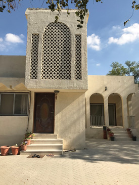
The above map represents one of my strongest memories of Sharjah. I am person who is very fond of walking and the sights I saw during these short trips are very much treasured by me. It was during this time that I used to reflect on my life and my past actions. Sometimes I even used to let my creative side wander into unknown spaces.
It was fun to capture this memory on paper. The excellent urban planning of Sharjah also helped me in the process of creating this map. However difficulties were faced in trying to capture all the details and trying to be accurate with the measurements.
STAGE 1:
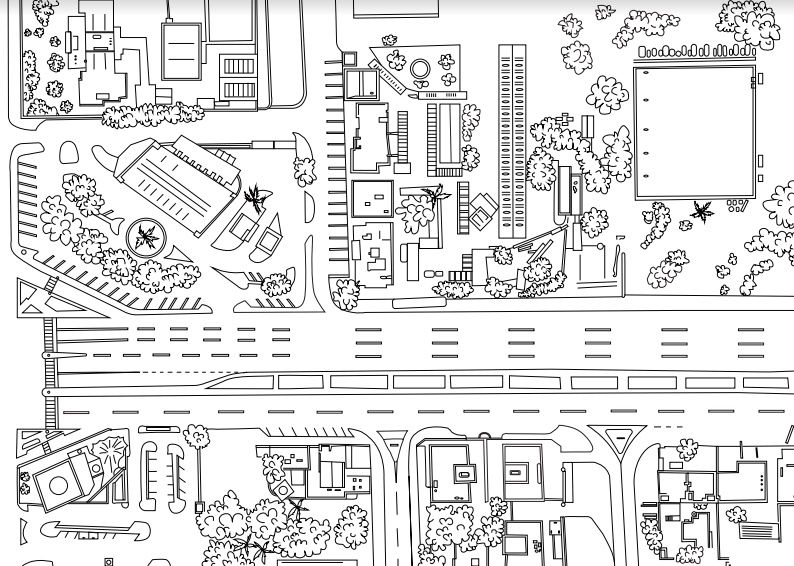
( Digital line drawing )
I have drawn the above map using three tools; pen tool, curvature tool and pencil. I started the process with just two tools, i.e. with pen tool and curvature tool. Pen tool was used to create straight lines of roads and buildings and curvature tool for the trees. However, later I realised that the pencil tool is more easier to use while drawing trees because it created less anchor points. It was a very slow and time consuming process as well. I was confused about the fact that I had to invest more time in the digital drawing rather than the hand drawn one.
Vibe: Comforting, therapeutic, nostalgic.
Certain suggestions to look into:

STAGE 2:
MY EXPLORATIONS OF ICONS :

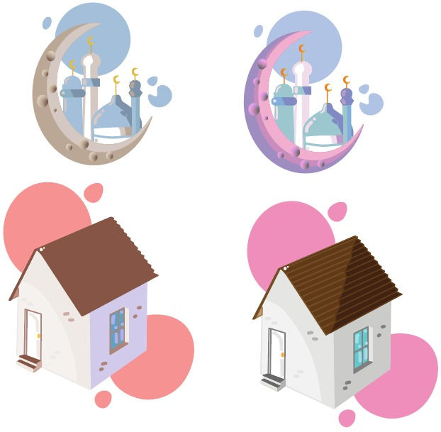
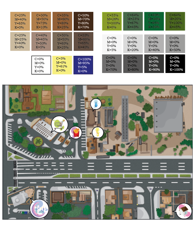
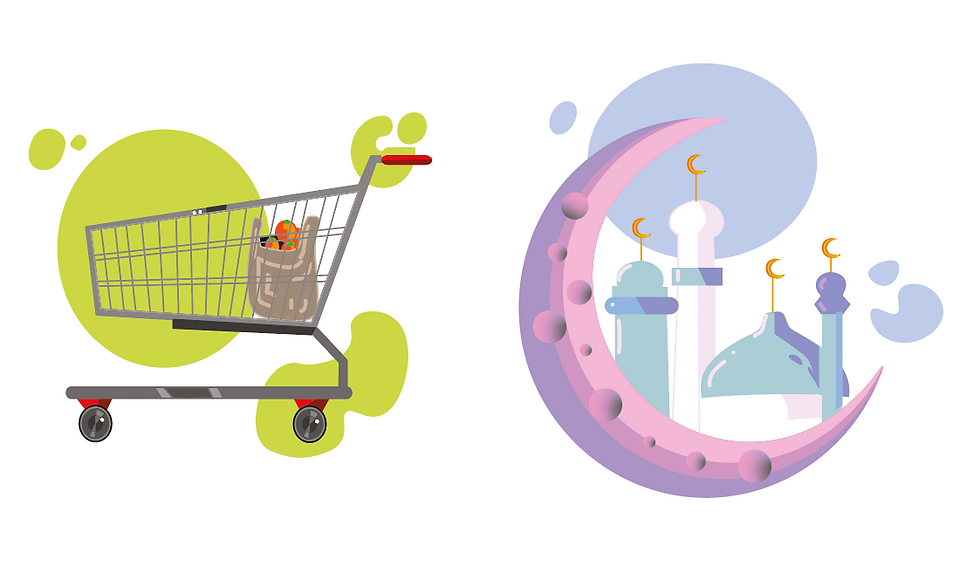
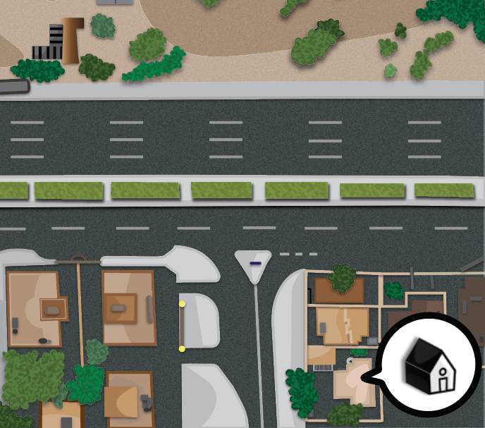
Icons (house, supermarket, water authority, mosque)
In the initial stages of making the icons, I thought of taking a more simplistic approach since I didn't want my icons to clash with my detailed map. I tried to accomplish this by creating simple line drawings with the Curvature tool. I also tried to achieve a glow effect by using different tones of the same colour and adding the blur effect.
I consulted this with my tutor and was suggested to create a more detailed icon because these icons might not compliment the map I made. Therefore, I decided to try explore this approach. I must say I was more satisfied with this result and I proceeded further by adding colours.


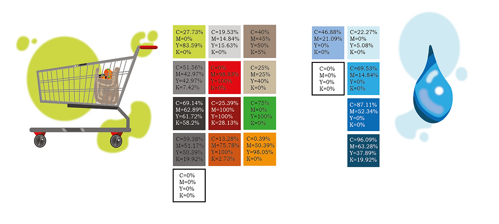
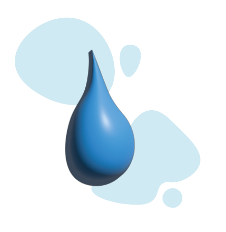
Icons (supermarket, water and electricity office, fast food joint, mosque, houses)
I tried to capture the vibe mainly through colours. The below shown images are some of my experiments with colour choices. In the initial stages, I went for more subtle colours. However I felt that this was not capturing the vibe I was going for. So I decided to go for a more fun and cartoonish colour choice because the area shown in the map is the place where I have spent most of my childhood. I wanted to capture the childish way of perceiving the world and colour. With the help of google, I managed to find a suitable colour swatch.

Colour swatch


While I was experimenting with different techniques in the past, I had come across the various textures that were available in the illustrator. This experimenting led to the discovery of how effective sponge texture was in capturing foliage.

I also added a speech bubble around the icons I made. I decided to go for a strong black outline to help the icons stand out more when placed in the map.

There was also explorations of different styles like the ones shown on the left, but I did not end up using these styles for my final map.
The blurred style gave an effect of a memory which was an aspect of the vibe I was trying to capture.
(Apply Gaussian blur).
Problem: However, I felt that the blur effect was not suiting my map.
The second pixelated look reminded me of Minecraft which was also a part of my childhood. This connection somehow helped in capturing that aspect of the vibe I was going for.
(Rasterize>Create Object Mosaic>50x50).
Problem: However, again this was not suitable for my more detailed icons as shown in the below image (right).


STAGE 2:
EXPLORATIONS OF STROKES AND TEXTURES :

Changes done :
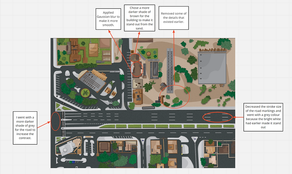
Increased the weight of the line for the buildings to 2pt. My intention was to increase emphasis towards the buildings through the use of strong lines.
The trees were given the smallest stroke (0.5pt) since I didn't want to emphasise it.
Added texture to trees (sponge, crosshatch) and road (film grain). I wanted to keep texture realistic.
Texture I decided to add in my final map:

(Foliage, grass, sand, road)
Certain aspects I wish I could've added :
I wish I could have included the dotted lines as well but I wasn't really sure where to.
Altering the shapes in my map was also not possible.
STAGE 3:
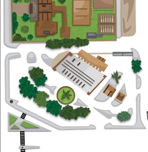
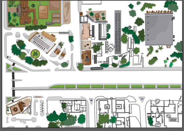
PROCESS OF COLOURING THE MAP :
I had a very frustrating experience during this stage of my illustrated vector map project. After nearly completing my map, I had closed the program without realising I had not saved it. Due to this I was unable to recover it. However, I would like to consider this as a new learning and I hope to never make this mistake ever again in the future. I now plan to redo this stage again and consult with my tutor regarding this issue.

Unfortunately, the program crashed and I lost my work again. Even though I had a saved copy, it was of the initial stage so almost all my work was gone again.
In my third attempt, I decided to be more careful. I started saving a copy of my work after every stage and I also took a lot of screen shots.


I never realised how true the saying "third time's the charm" was. Fortunately, my third attempt proved to be successful. It was very exciting to know that I can finally present my work.

(Coloured map)
Few tools that was very handy :
Eyedropper tool was especially useful for transferring colours from a swatch.
Shape Builder tool was useful when it came to filling in colours.
Start global edit helped while filling the colours of the road markings.
EXPLORATIONS IN COLOURS :
Buildings:
All these years of living in Sharjah made me realise that most of the buildings are usually in different shades of browns. I tried to capture this aspect in my map.

I wanted to replicate the true colours of the structures in my map. Below shown are some examples of this.
(My house)


(Al Sahaba Mosque)


Trees:
(Date palm)


While colouring the trees I didn't want to exactly replicate the colours because I wanted to exaggerate the uniqueness of each tree by using different kinds of greens and by individually drawing each tree instead of simply copy pasting.


Terrain:


Like the buildings, I tried to capture the actual colour and texture of the terrain.


Apart from trying to mimic the actual colours of the different elements found in that area in my map, I have also tried cover another aspect as well. One of the keywords that I had chosen for my map was 'comforting' and I have tried to represent this word in a rather different and in a more personalised manner. I have always found bright and fun colours to be comforting because it reminds me of cartoons which was often a tool that I used to escape reality. The map has a cartoonish look to bring in this aspect. I was also trying to capture the concept of how a child views his/her surroundings differently.


(Colour scheme with CMYK values)
STAGE 4:
ADDING LABELS :
In the beginning I was a little unsure whether I should add labels because I wanted to avoid over-crowding my map and I felt it wasn't it was not really necessary because the icons provided enough information.
However when I rechecked my pre-work drawing I realised that I had mentioned certain other buildings as well. So for these I decided to add labels.

So far in my map I hadn't tried creating 3-dimensional shapes, so for the labels I decided to try this technique. There is another aspect as well that made me choose this style. I wanted the text be noticeable and since my map is completely 2-dimensional, the easiest way to make my text stand out was to create it 3-dimensional.
Regarding colour choices of my text, I went with a lighter shade of blue so that it stands out from the dark background. I also made the labels very small since I didn't want it to create a distraction from the main map.
Since this is the area I spent most of life in, I decided to name my map in this basis.
CONCLUSION:
This map project definitely felt like a rollercoaster ride for me.There were many struggles faced during some stages, however, the final outcome was completely worth it.
Throughout the project there were areas where I succeeded and areas where I had to improve. Some of those areas are as follows:
Where I succeeded:
Pre-work and stage 1 went quite smoothly for me. I found it easy to use the pen tool and the curvature tool.
I was able to successfully utilise the technique of shading that was taught to us during the digital sessions by our tutor .
I was able to understand the various tools and techniques that were taught during the digital lab sessions.
Where I have to improve:
During the later stages I had certain problems with my device and I started lagging behind and due to this I was unable to attend some of the one to one sessions. In such situations I need to learn to adapt and improve my time-management in order to avoid lagging behind.
I also feel like I could have maybe explored more with the different styles and techniques.
I also faced difficulty in understanding which typography was suitable in which context.
I was also not completely satisfied with the Stage 2 of my map. I feel I could have explored textures even further with the use of brushes.
I should have also tried limiting the colours used on the map.
I should also try to learn how to communicate properly. This problem was evident especially during the time I lost my work because instead of trying to reach out to people who could have helped me, I tried to solve the problem by redoing my work thrice.

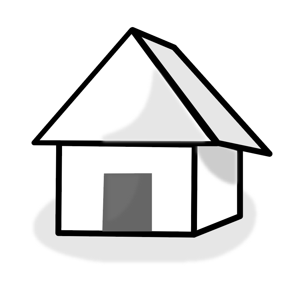
I tried the 3-d approach in my icons.


However I faced difficulty in some of my icons (below shown). The 3-d effect was also slightly deviating from the cartoonish effect I was going for.
ATTEMPTS TO IMPROVE:
Background:


Icons:

(Home)
I tried designing a more simpler icon for my map. I avoided using colours to make the icons stand out more in my colourful map.


Comments