LJL FVL-2
- Oct 31, 2021
- 4 min read
Observe and investigate to learn and create.


OBSERVATION AND REPRESENTATION:

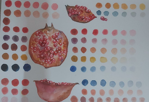
1. When it came to representing an object in a 2-d form by observation, the first aspect that I looked into was the form or the shape of that particular object. In my case, through observation I found out that my pomegranate was not perfectly round and instead had a lot of bumps and irregularities in it's shape. The flower shaped part on the top portion of a pomegranate (Persistent calyx) was also very important in order to capture the complete essence of a pomegranate.
Understanding the form helps in increasing the accuracy of the representation. The true essence of a pomegranate can be captured mainly through its form.


I realised that this was the reason why FVL sessions usually started with the drawing of the form before proceeding with filling in of colour.
2. After form I moved on to identifying colour. As you can see in the above images, the top portion off the pomegranate has a yellowish colour. I mainly used Yellow Ochre for this. Right underneath this portion there is a bright reddish-pinkish spot which continues toward the whole bottom portion. This bottom portion is also much more darker so I added Burnt Sienna and Ultra Marine. This combination also continues towards the extreme right of the pomegranate. The Persistent Calyx was also quite brownish so I used the same set of colours (Burnt Sienna, Ultra Marine and yellow Ochre).
Colour is an important aspect when representing an object because it further helps in identifying the object and also helps in creating volume.
3. The next aspect that I observed were the highlights and shadows. But making this the third step was a mistake since I couldn't bring much highlights because we weren't allowed to used white.
While observing I noticed that the area right underneath the area with the yellowish colour was where the light was falling. The bottom part of the pomegranate was dark because of the shadows.
Observing this step is important in order to create an illusion of volume in a 2-d drawing.
4. I noticed a unique feature in my pomegranate. There was a black line going across the body of my pomegranate. I captured this by using Burnt Sienna and Ultra Marine.
Such features helps in adding uniqueness to the fruit as well as the drawings.


5. Texture was another aspect I observed. I found difficulty during this stage because I was not sure how to capture texture without using white. In the image It can be clearly seen how the texture of the pomegranate skin has highlights on it. I tried using dots to capture some texture but I wasn't completely satisfied. I should have maybe tried using oil pastels to capture some texture.
Understanding texture is important to get a complete sense of the pomegranate. Texture also gives an illusion of a tactile sensation to the drawing.

VISUAL MEDIA:

1. Looking at the two mediums I realise that the oil pastel had a much more smoother finish compared to water colours.
2. I found it difficult to create thin lines and capture some details in both mediums as seen in the below images. The minute details were difficult to do with these mediums because the use of water and the blunt end of the crayons made it difficult to control.


(Real fruit, oil pastels, water colours)
3. While I was observing my fruit I noticed that the skin of my pomegranate had spots/freckles.


(Real fruit, water colour, oil pastels)
As seen in the above images, I was easily able to capture this using water colours but this was not so in the case of oil pastels because my oil pastels had a very blunt end.

4. Capturing the original colours was more easier with water colours when compared to oil pastels because it is easier to combine colours in water colours when compared to oil pastels.
5. Another difference I noticed between the two mediums were that I had to spent more time and effort on oil pastels compared to watercolours. For oil pastels, I had to put a lot of layers to get the correct colour but this was not needed for water colours.
CONCLUSION:
The overall FVL-2 experience was very informative. I mainly learnt how to observe closely and represent my observation in a step-by-step manner.
Struggles:
Often I faced difficulty when it came to understanding the brief. Usually after the initial confusion I manage to figure things out by seeing other's works etc.
I wasn't able to go beyond what is practised during the classes.
I faced a slight struggle in the exercise that was done on the day I was absent. Main difficulty faced was regarding understanding the brief. This showed me how important it is to be present in the class.
I still face difficulty in understanding what is expected in the Daily Drawing Document.
Key Learnings:
I have learnt to observe objects closely and represent them in a systematic step-by step manner. This skill will be useful not just in representing an object or in drawing but to other aspects like researching, designing etc.
I have learnt to capture the exact colour and create swatches.


I understood more about how highlights and shadows can be used to create the illusion of volume and how having negative spaces is sufficient for creating volume in a 2-d representation.

While using oil pastels I discovered that going over the entire colouring with a white oil pastel can help give it a more smoother finish. This technique will be useful whenever oil pastels are used in future projects.

(1- Without white, 2- with white)
Future Inquiry:
I would like to try the same in a much more micro or a macro scale.
I am now curious to see how this learning will help in the speciality I have chosen and how many times I will come back to refer to these learnings.
Creating textures in a two-dimensional drawing was something I hadn't explored much in the past. I would like to take this learning forward and observe and represent just textures.


Comments